
Data Visualization
Explore, learn, and play all things data visualization
Mapping ETEC522
Before we get started, tell us a little about yourself. Where do you live, work, and play?
Add a pin to our custom Google map
Click the "add marker" button on the top pannel to add your pin

Click around the map to see where your classmates live!
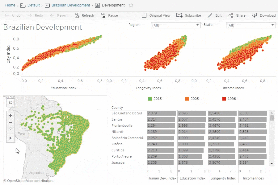
Maps, like the one we just created, can be used as a super helpful visualization tool!
Everytime somebody adds a pin, another data point is added. Together, we are producing a visual representtion of data, meaning this map is a type of data visualization.
But what is data visualization?
Let's find out!
What is data visualization?
To break it down simply, data visualization is presenting data in graphical or pictorial forms, which makes the information, or the content of the data, easy to understand. It explains facts, and is an innovative way of presenting complex information (Sadiku et al., 2016).

Data visualization is used all around us: whether it be professionally – we may see data visualized in the workplace to demonstrate Human Resources metrics of measuring productivity, to conduct analyses of public health resource consumption and allocation, or using visuals to detect patterns within large sets health information in a research project.
We may also see data visualization in simpler, everyday forms: organized colour palettes, infographics displaying pairings of wine with food, subway maps, and more.
Reflect on how many ways you may interact with data visualization every day - it may be more than you think!


Overall, data visualization can be used to translate a very wide range of information – whether qualitative or quantitative, scientific or art-based, or professional or educational. Essentially, our world as we know it today runs off of the creation, analysis, and translation or use of data, and education is not exempt from this. Data visualization can be used to influence or reshape the future of education on a global level or individual level, and can be seen in use in every classroom.
Data visualization is a universal language
Beyond simply displaying data in various means as inserted above, well-produced data visualization can tell a story that helps target audiences make sense of the information and draw meaningful conclusions. When done well, data visualization empowers decision-makers to identify patterns or trends, and outliers or correlations that may otherwise remain hidden amidst an overwhelming, endless sea of numbers and statistics.
Data visualization, as a whole, is powerful - and this is seen in its ability to cater to diverse audiences, including professionals, students, and members of the general public: whether financial performance, consumer trends, scientific findings, or geographical data (as seen above!), data visualization serves as a universal language that sees no boundaries and barriers, and can be used to facilitate effective communication.

Overview: how can data visualization be linked with education?
Let’s break down the many ways we may see or use data visualization in education:
-
We could accumulate data on how well schools, courses, or teachers are performing – and use the data to inform improvement
-
Learners can see how they are progressing: we can look at their grades across courses, see patterns across years, and more
-
When students create a poster presentation, a report, and more – they are visualizing the information they have gathered or learned